Lambert Tire
Rebrand
Visit Site
Lambert Tire is a family-owned tire shop that has been in business since 1961 located in Carrollton, Georgia
Duration
-
4 months (2017)
Role
-
Lead Designer
Visual Designer
Brand Designer
Collaboration
-
Owner/ Stakeholders/ Accounting/ External Printers
+
Problem
Client had quit his job to take over the family business of Lambert Tire Co. In Carrollton, GA
They had been in business for 60+ years with no branding at all.
The Client had a very specific look and feel in mind for the branding of his family’s company.
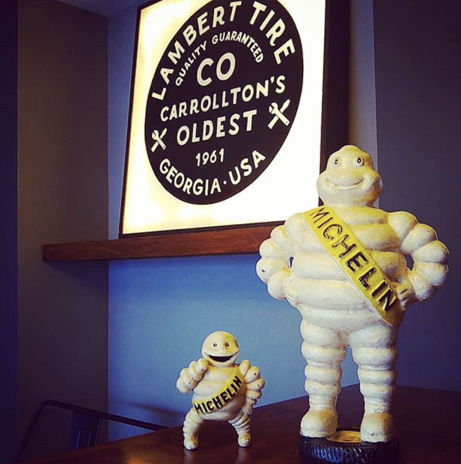
He wanted a vintage/modern/industrial feel for the rebrand as well as for the remodel for the waiting room.
He did not want you to think that you were in a tire establishment, but that you were enjoying your time in a hipster coffee house.
+
Mood Board

+
Color Palette
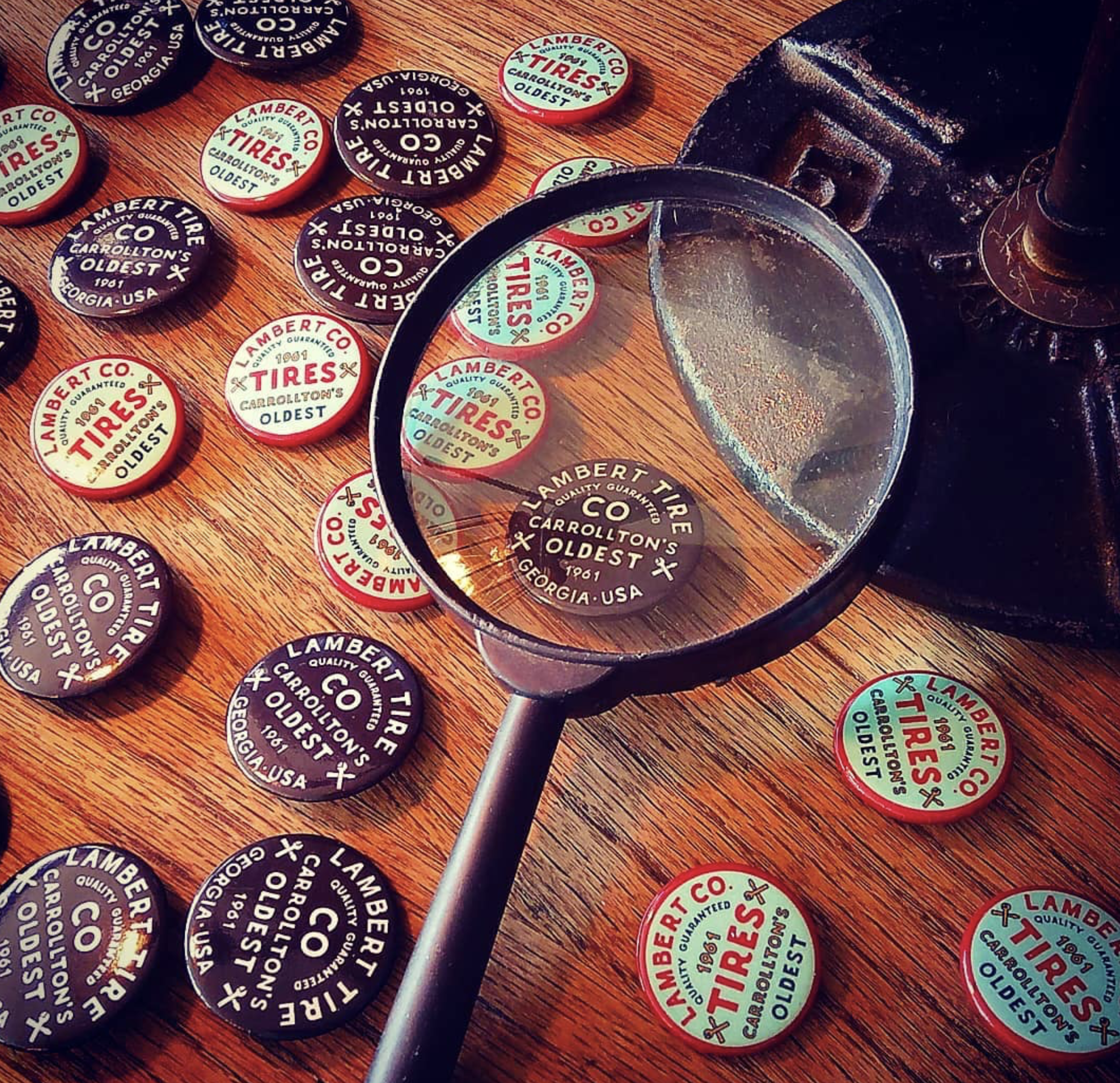
The client and I chose black as the primary color to match standard tire colors. We wanted the logo to resemble a tire.
We also chose earthy tan colors to resemble the history of the brand due to the fact this company has been around since 1961. We wanted to keep the history within the branding.
+
Logo Sketches
+
Logo Proofs
I always like to give my clients 3 options to the most.
The reason being is because according to the jam theory people truly don’t know what they want and when you give someone too many options they are overwhelmed with choices. Therefore it will be harder for them to make a choice.
+
Second Proof
The client loved version A.
He felt that something was missing from the logo
The client suggested to add nuts and bolts to the side of the logo above the word Georgia • USA
My solution for this was to add two tools as vector images instead. Because trying to fit a nut and bolt in a logo would not be clear of what the image is when scaled for business cards or a website.
+
Final Logo
He was looking for a more hand-drawn feel for the branding of Lambert Tires.
My solution to this was to create outlines on the type face which creates a vector based font, therefore it is scalable and editable. I then used the pen tool to edit the typeface

+
Printed collateral


+
The sign outside of the establishment
🛞
🛞
After the logo was finalized, I then designed a Tire Rotation and Oil Change Sticker


+
Business Cards
I always give my clients a few options.
I gave my client 2 options for business cards, he chose the left design.
I felt that was a good choice as well because having the split in the design really breaks up the text and the logo, which makes it easier for scanning and reading.
Resources


