SMOKING GOAT
FARMS
Smoking Goat Farms
Website Redesign
Visit site
Smoking Goat Farms is owned by 2 farmers who love to cook, who believe in sustainability and using real & non-gmo ingredients. Their products are locally grown and smoked on a small farm located in the mountains of Tennessee.
Duration
-
3 months – 2022
Main Resposibilities
-
Project Lead
UX Design
UI Design
Visual Design
Photographer
Collaboration
-
Client / CEO / Director of Digital Engagement / Sales Team/ Stakeholders / Accounting Team/ Logistics Team/ Research & Development Team

+
Design Thinking
+
The Problem
I learned from the client and previous research data conducted by Amaze Group that the problem was that their website was very difficult to navigate. The website only had one payment option, therefore they were losing potential customers. There was no consistency throughout the images on the website, it was also not geared towards the user and for their ease of use and experience.
+
The Challenge
How to create a more user friendly shopping experience, check out process, re-capture product photography with similar aesthetics, & stay within budget
Quantitive research showed that I needed to improve the shopping experience.
[01.]
Customers had difficulty navigating the prior website due to lack of user testing before launching their previous website and the visual patterns were not clear enough
[02.]
Images were inconsistent with different aesthetics, which was misleading to customers
[03.]
Customers had an issue trusting Smoking Goat Farms purchase experience because they were not getting notifications throughout the entire purchase process
+
Target Audience
I learned from previous research done by the Amaze Group that their target audience are Millennial’s ages 26-30.
75% of respondents were female that make less than $20,000 annually.
These individuals:
• Love cooking
• Interested in healthy alternatives
• Like unique flavors
• Like to host dinner parties
• Shops at Whole Foods, Kroger and Publix.
• Interested in experiences
• Budget Friendly
• Eco-friendly
To add to this research I also did my own research, and according to the barcode blog millennials are revolutionizing food logistics, because they are starting to choose more whole, organic foods and buying less processed foods such as pasta and potato chips.
Millennials also want Convenience. 55% of millennial say that convenience is one of the most important factors when deciding where to buy food.
From this stores are changing their layouts to please millennials, due to the fact that the impulse strategy no longer works. Not only that but millennials are actively avoiding grocery stores all together and utilizing online grocery shopping and meal delivery services
+
Color Palette
The color palette reflects the spicy, smoked, and western wanted poster nature of the brand.
We always kept the user in mind while creating a cohesive experience.
🌶️
🌶️
+
Previous Homepage
The hierarchy on the previous website was not visually pleasing.
The dark background makes it hard to read the description on the product pages, the logo was too small on their header banner, there is too much text, which I moved to the about us page.
I found that there were too many different typefaces that were not consistent with the brand identity.
This website was also not optimized for mobile, which is how their target audience interacts with the site
+
Solution 01
Move their website from Wordpress, and to Shopify for a more enjoyable shopping experience
I was able to empathize with the end users because after my own testing on the prior website it was difficult to navigate the site due to the lack of visual patterns were not clear enough, the type face was difficult to read as grey on top of a wooden background. The buttons were not noticeably clickable which was confusing
+
Shopping Journey
+
Solution 02
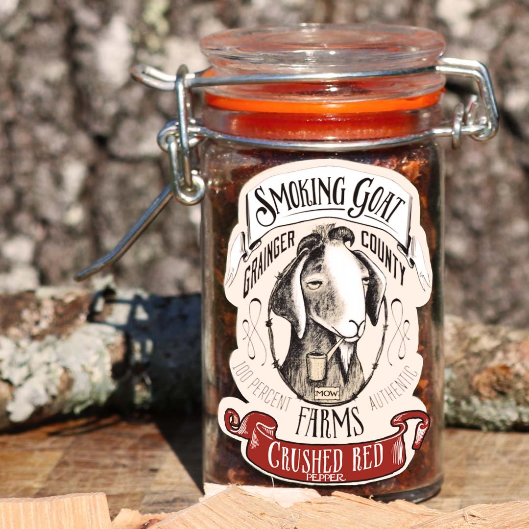
Create consistency throughout the website images by using the same backdrop for all images. To stay under budget we captured these images in-house
Research from Amaze Group revealed that the product images were not uniform throughout the site. Some images had spilled salt around the bottle, the glass was blown-out and over edited. Amaze Group also mentioned that each image was the same product with a photoshopped label which can be misleading to customers
With this information I volunteered to take product images. I collaborated with the development and logistics team to get all of their products delivered to me


+
Solution 03
Create a seamless checkout process. That also enables the customer to have a more enjoyable purchasing experience.
The customers were not being notified after their purchase, therefore I created a more enjoyable after purchase experience where the customers get notified throughout the shipping and delivery process.
To stay within budget I utilized Shopify’s platform for their simplified checkout process and to cut down on design time.
The customers goal was to integrate more payment options. According to customer feedback they stated they would like other options of payment other than only PayPal
+
Purchase Experience

+
Responsive Website
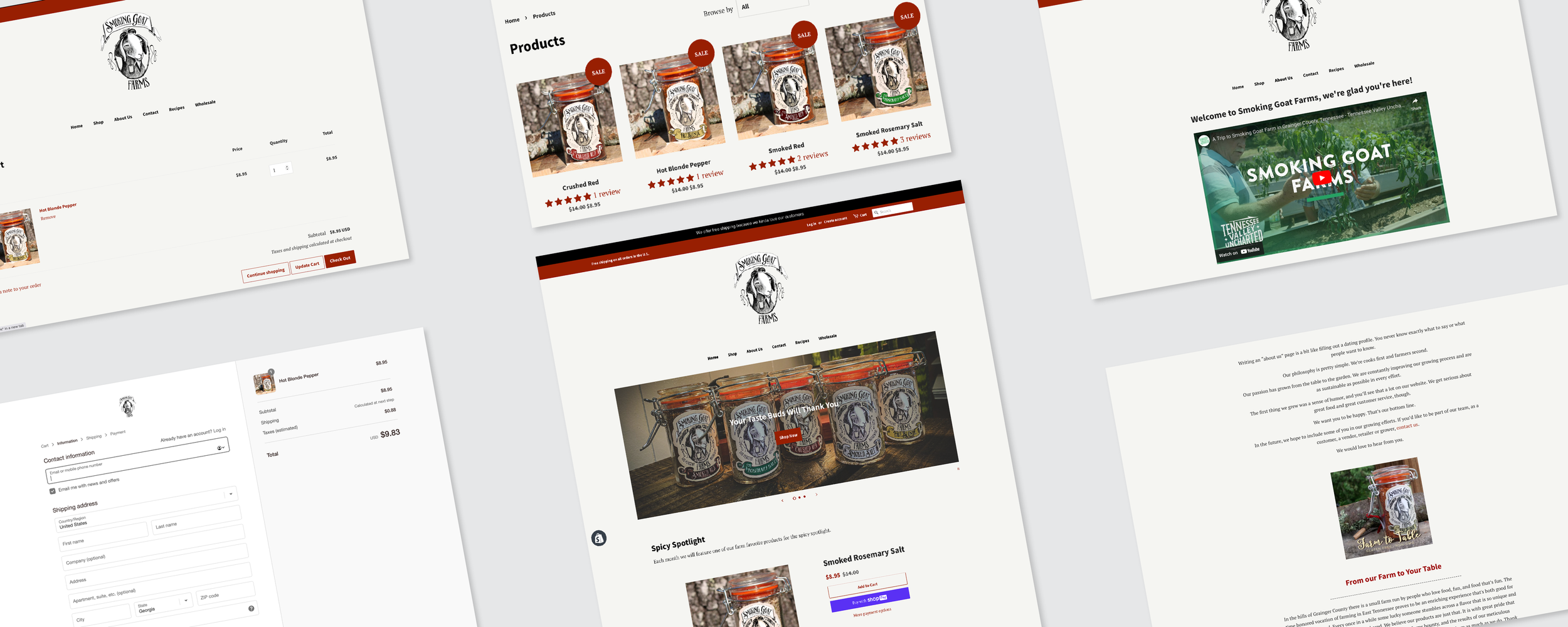
With all of the data and research from above, I implemented them on the new web design.
The client wanted to keep the feel of an old western wanted poster, therefore I I chose the color tan for the background of the website because it conveys the feelings of history and connection according to picsart.com
I Chose red for the secondary color because red is a bold color that is eye-catching and it helps draw the users attention. It is also supposed to increase appetite which is why so many food brands use the color red and because it is the first color most people notice.
I moved the embedded video from the front page and moved it to the about page as a link for better optimization. I also moved the text from the front page to the about page to not overwhelm the customer with information overload on the front page
I used a minimum of two type faces which were PT Serif and Source Sans Pro Bold

+
Social
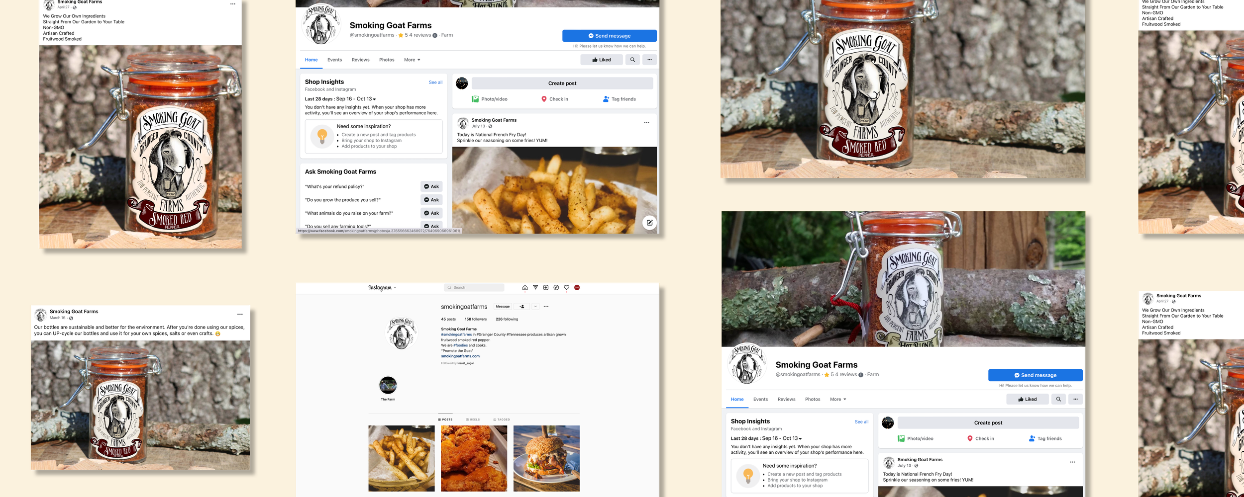
To stay consistent on branding across platforms, we used their logo as the profile image.
We utilized their website photography and the branding narrative throughout all platforms for a uniform branding voice.

+
Email Marketing


