Lambert Tires
Rebrand
Visit Site
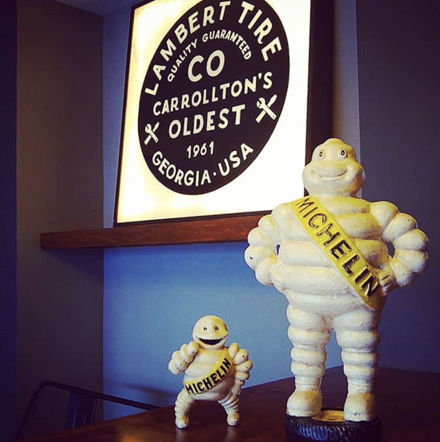
Lambert Tire is a family-owned tire shop that has been in business since 1961 located in Carrollton, Georgia
Duration
-
4 months (2017)
Role
-
Lead Designer
Visual Designer
Brand Designer
Business Owner
Collaboration
-
Owner/ Stakeholders/ Accounting/ External Printers
+
Mood Board

+
Color Palette
The client and I chose black as the primary color to match standard tire colors. We wanted the logo to resemble a tire.
We also chose earthy tan colors to resemble the history of the brand due to the fact this company has been around since 1961. We wanted to keep the history within the branding.
+
Logo Sketches
+
Logo Proofs
+
Second Proof
+
Final Logo
He was looking for a more hand-drawn feel for the branding of Lambert Tires.
My solution to this was to create outlines on the type face which creates a vector based font, therefore it is scalable and editable. I then used the pen tool to edit the typeface

+
Printed collateral


+
The sign outside of the establishment
🛞
🛞
After the logo was finalized, I then designed a Tire Rotation and Oil Change Sticker


+
Business Cards
Resources


